

Citrus: Freemium to Premium

Problem Overview
Citrus is a music based streaming app. Although Citrus boasted a heathy user base of free users and was widely well received, the platform had a hard time converting users to their premium service, Citrus+. I wanted to re-design the experience to effectively convert free users to paid subscribers.
What are others doing?
Setting a Goal

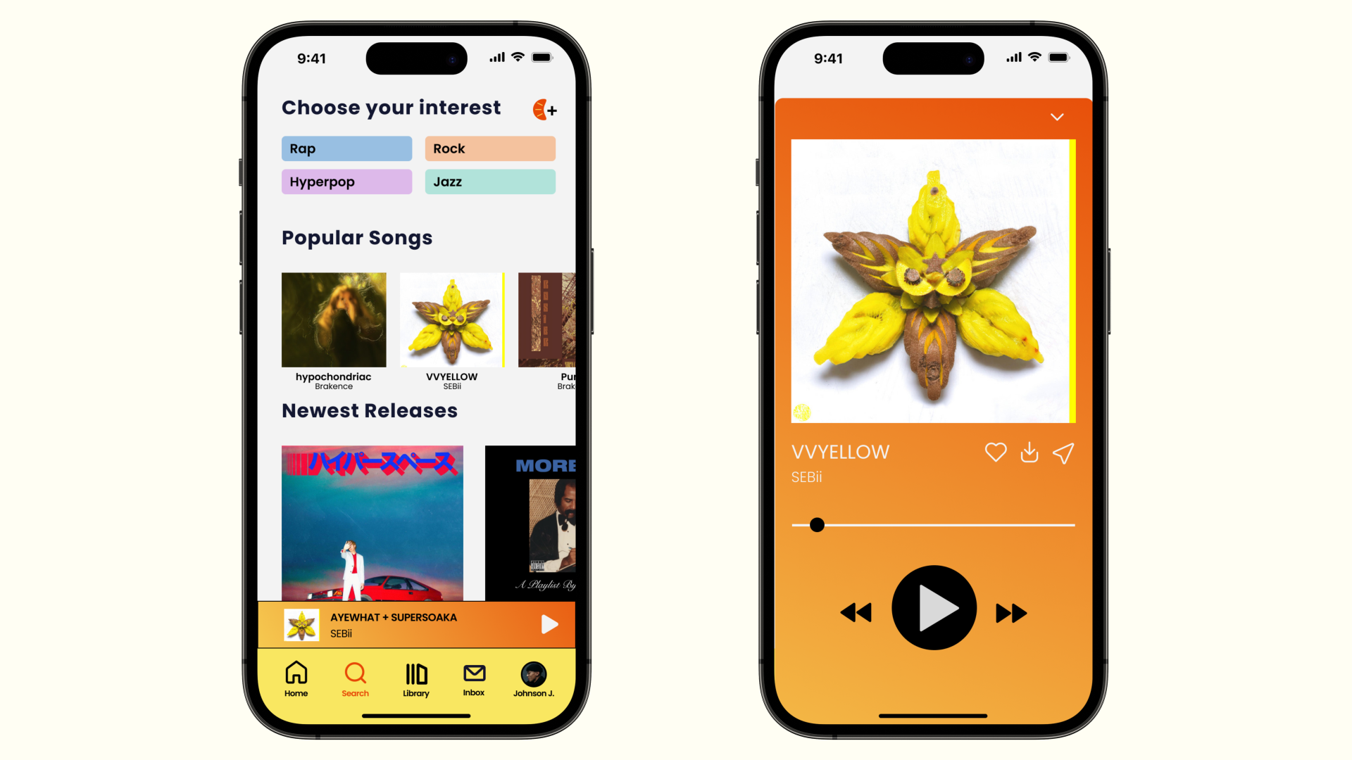
I started my research by learning what Citrus offers as a free version and comparing that to Citrus+ to fully understand what the benefits are in upgrading.
Problems with the Current Solution
When trying to use Citrus, it's evident that the approach to converting free users to premium subscribers is far from effective.

User Research Findings
I interviewed potential users to learn about their thoughts on the current app. I took notes on what they vocalized feeling and how they would react to different scenarios. I asked them things like “What would make you consider upgrading to the premium version?” and “Do you use other music streaming services? If so, which ones, and why?”


Pandora: Uses fewer audio ads, but limits skips. Might not strongly motivate casual users to upgrade.
YouTube: Cluttered interface, challenging to find premium sign-up options. Design may hinder premium conversions.
SoundCloud: Promotes "SoundCloud Go" well without compromising the user experience. Provides transparency in explaining interruptions, building trust.
Spotify: Takes a subtle approach to promoting Premium. No pop-up ads, banking on the quality of service. Successful user engagement features like "Wrapped" showcase their confidence in user conversions.
Designing
Wireframing
To make it more enticing for free users to upgrade to Citrus+, I wanted to highlight the payment plan that Citrus+ offers and provide the user information in the most transparent way possible:

How might we make it easily discoverable to learn about Citrus+ offerings?
Previously, the ways that users were discovering how to upgrade to Citrus+ was through buttons sprinkled around the site. Although this provided easy access to upgrade, it didn’t feel too welcoming.

I decided to create an engaging and visually appealing introductory tour or tutorial that highlights the premium features of Citrus+.


Hi-Fi Iterations and User Feedback
I had 5 potential users look over my work during this process to give me feedback on what looked good and where they felt confused. Below are snippets of feedback that I used to improve my design.


Final Designs
Taking the feedback into consideration, I developed a final set of screens and linked them into a tappable prototype.


Reuslts
Through my research, I found that there are a few things that help convince users to subscribe to paid subscriptions from freemium models:
Make sure that the value proposition is clear. What are the benefits that users will get by subscribing to the premium product? Make sure that these benefits are clearly communicated to users.
Make the process fun and intuitive. Doing this will engage users and make them care more about upgrading.
Be transparent. The more transparent you are, the more trust you will build with users.
User Persona

Crafting a How Might We statement
The interviews helped me empathize with user needs and helped me write out a goal to set the tone. I chose “how might we…” statements to decide what our top priorities were.

"How might we improve the discoverability of Citrus+'s premium features and incentives within the user interface, making it more enticing for free users to consider upgrading?"

Learning about Citrus
Team
Maximillian Navarro
Timeline
4 Weeks
Tools
Figma, FigJam, Pen + Paper
Roles
User Research, UX Design, Prototyping
Reflection: Lessons Learned
Don’t set unrealistic deadlines. There were a lot of times I had to move deadlines around because of schedule conflicts or outside factors. I know now that I have to be honest with myself and the people I work with to be able to provide the best work possible.
Ask many different people for input. I noticed through my testing I would always get similar people to test my designs. While it was helpful to get their input, I needed others who thought completely different to open my eyes to problems/solutions I haven’t thought of before.